
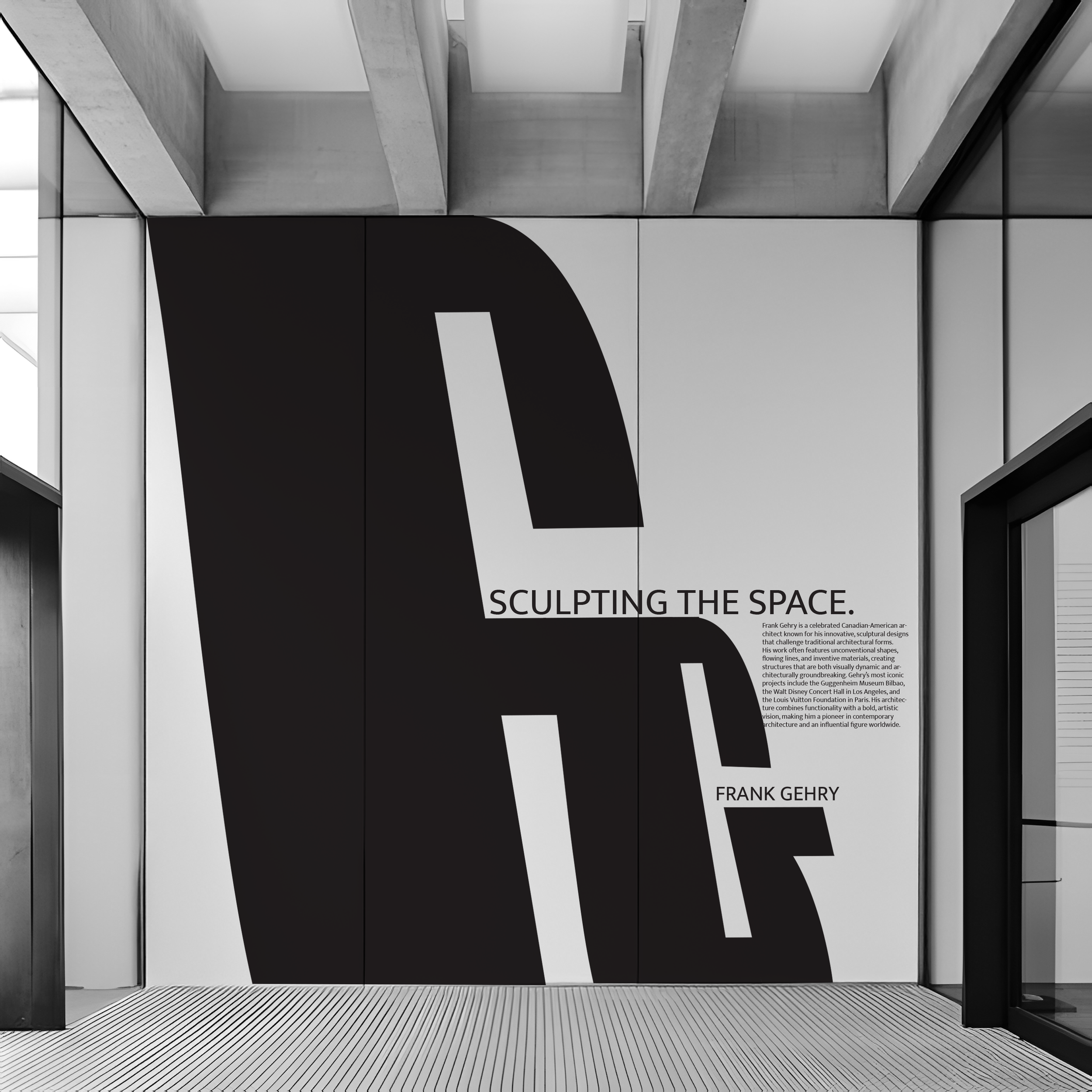
Frank Gehry
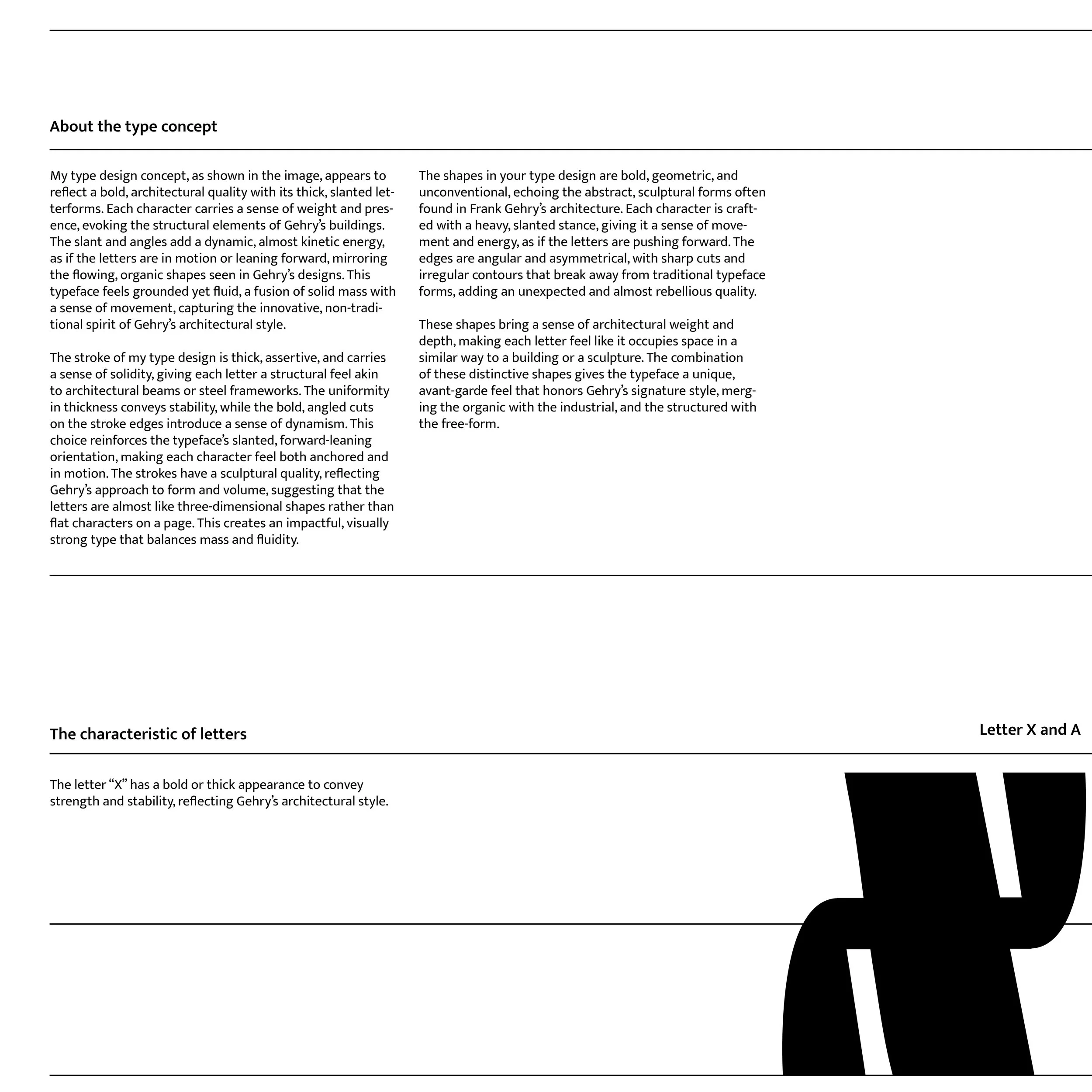
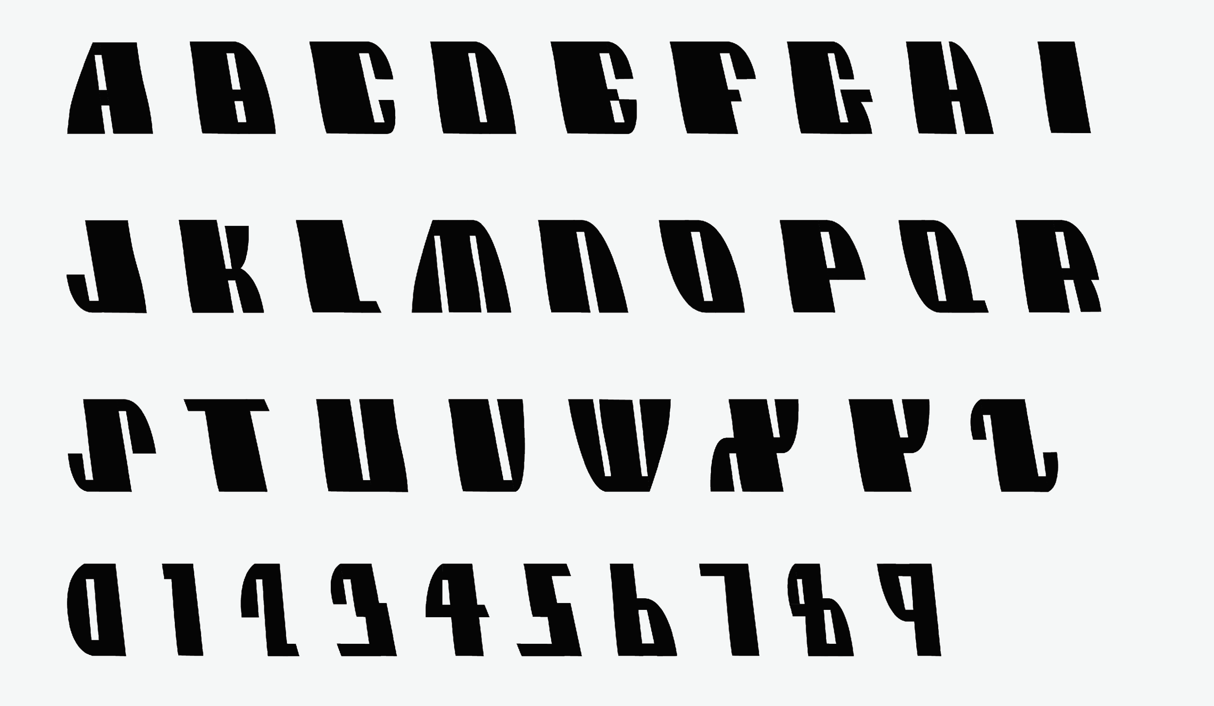
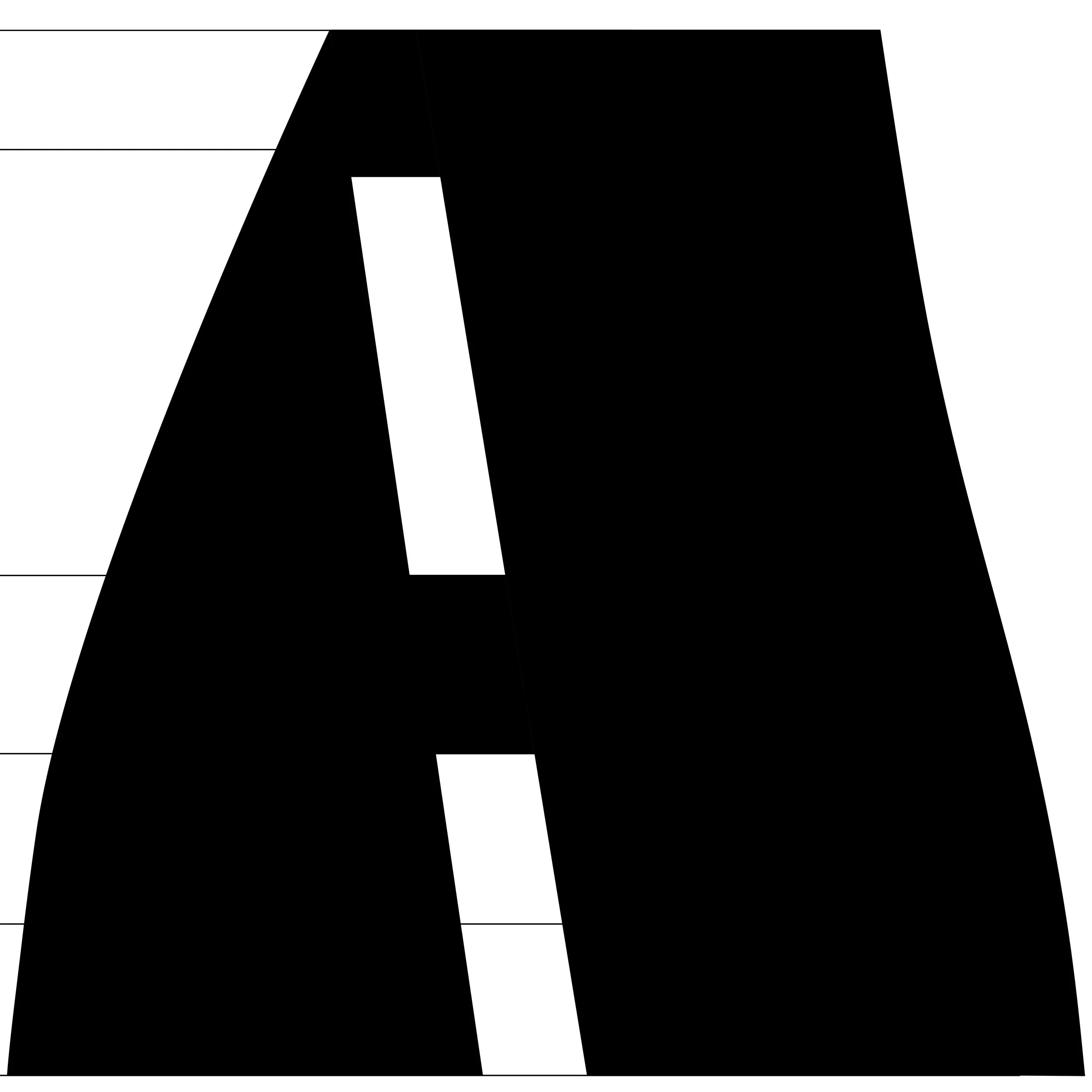
A custom typeface inspired by Frank Gehry’s deconstructivist architecture, translating his sculptural energy and fluid complexity into expressive letterforms.
Graphic Design
Type Design
Adobe Suites
Figma
Individual Project
7 - week course project
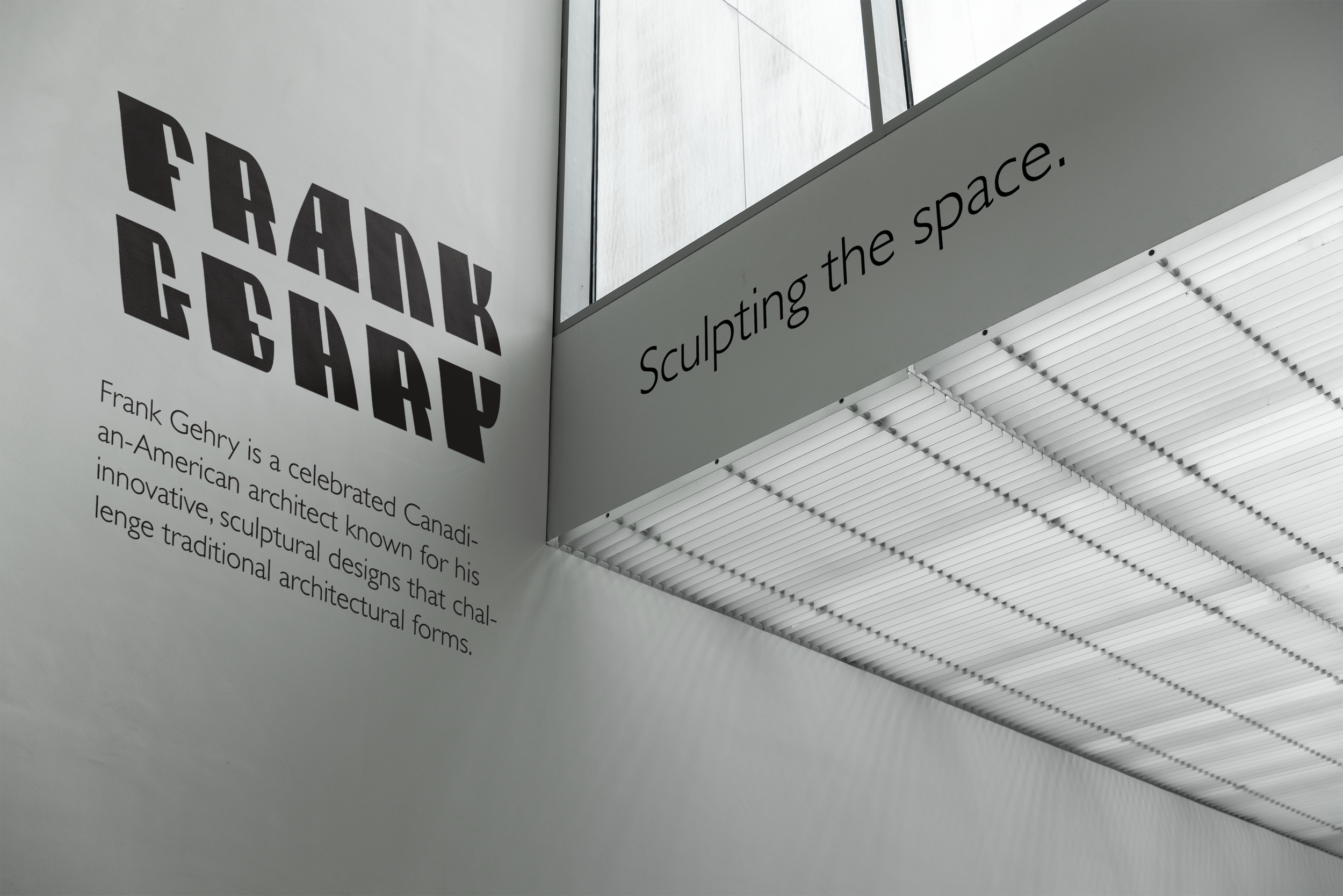
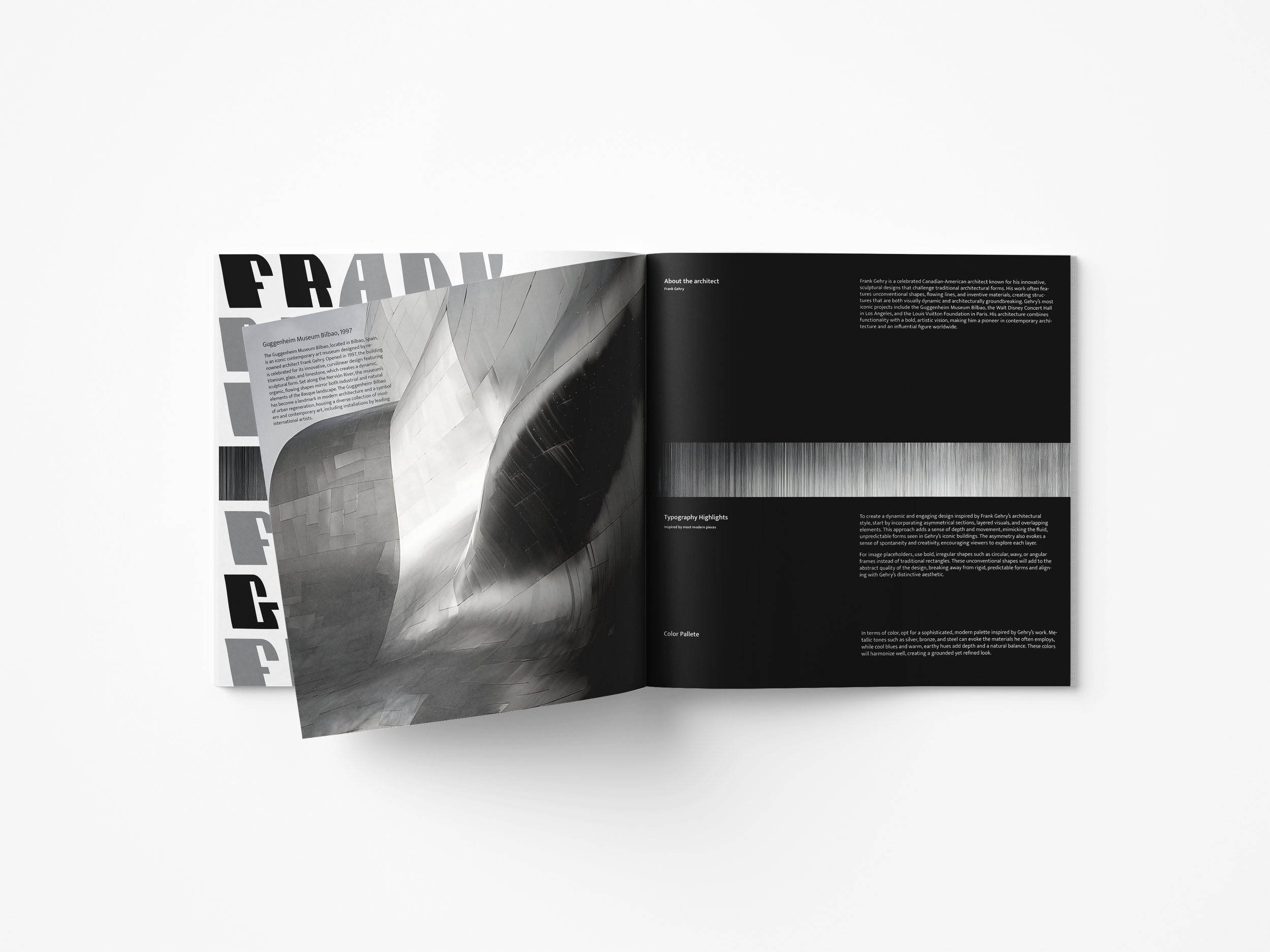
This project explores the intersection of architecture and typography through a custom typeface inspired by Frank Gehry’s expressive and unconventional forms. By translating his sculptural, deconstructivist approach into letterforms, the typeface captures the same sense of tension, movement, and fluid complexity found in his buildings—turning structural chaos into visual rhythm.
“Gehry’s work has always fascinated me—his buildings feel alive, unapologetically imperfect, and full of emotion, which is exactly what I wanted my typeface to capture.”
Typography Design
This typography is a tribute to Frank Gehry’s bold vision. I’ve always admired how his architecture transforms chaos into harmony, and I aimed to capture that same spirit in letterform—where each curve and distortion mirrors his sense of motion, emotion, and defiant beauty.
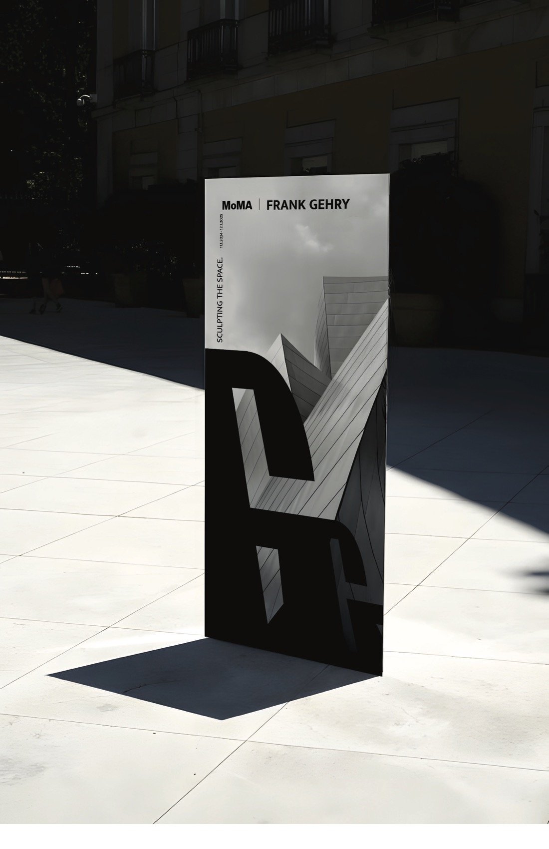
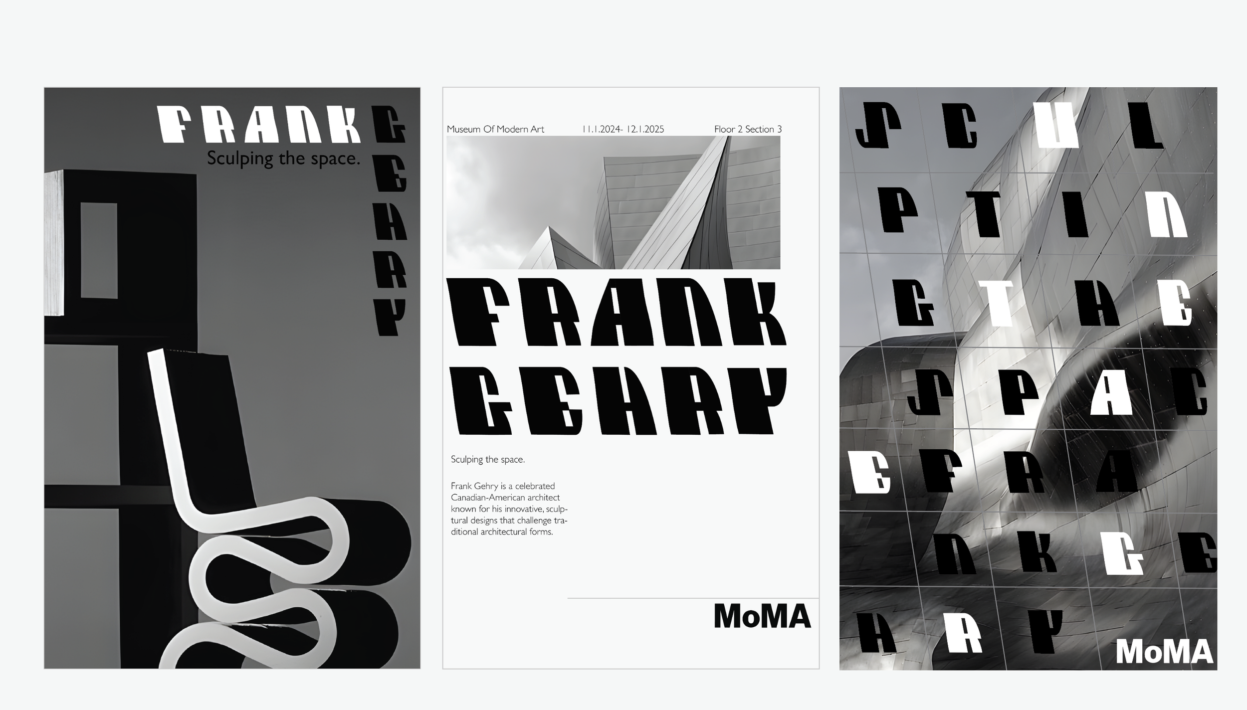
Poster Design
The poster design reflects Gehry’s dynamic architectural language through layered compositions, fragmented shapes, and shifting perspectives. Each element echoes the typeface’s sculptural quality.
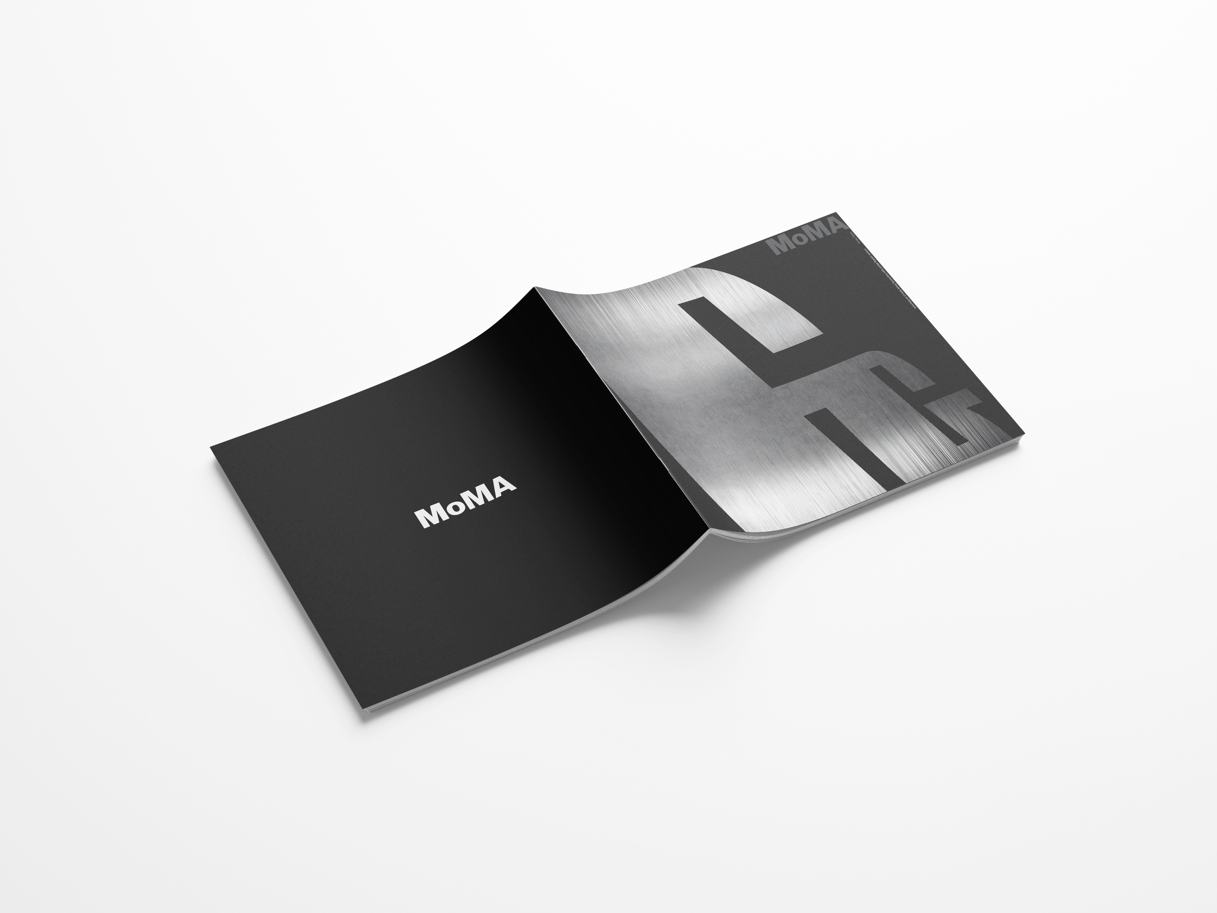
Promotional Materials
Each piece emphasizes movement and structure through bold typographic layouts, metallic textures, and dynamic compositions—bringing Gehry’s architectural energy into digital and print experiences alike.
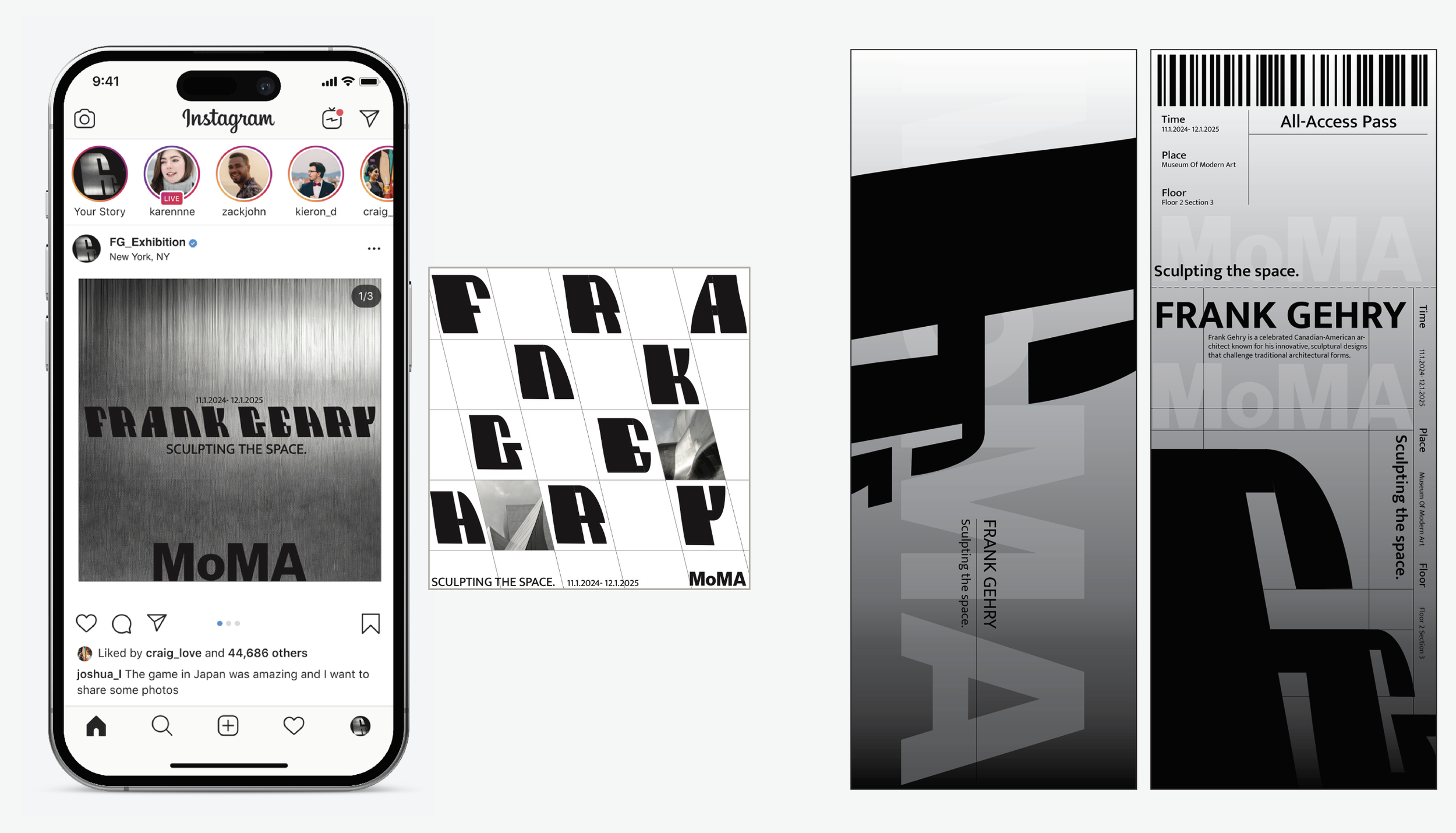
“Seeing my work imagined for MoMA felt surreal—like my admiration for Gehry had come full circle, from a student sketching his buildings to creating something in dialogue with them.”
Reflection
This project taught me how design can translate emotion through form. Studying Gehry’s work pushed me to let go of perfection and embrace movement, distortion, and unpredictability as part of the creative process. It reminded me that good design isn’t always about control—it’s about capturing feeling, rhythm, and the humanity behind every curve.