
Parent’s Website
A personal website designed for my parent, focused on clarity, accessibility, and ease of use across devices.
UIUX Design
Branding
Adobe Photoshop
Figma
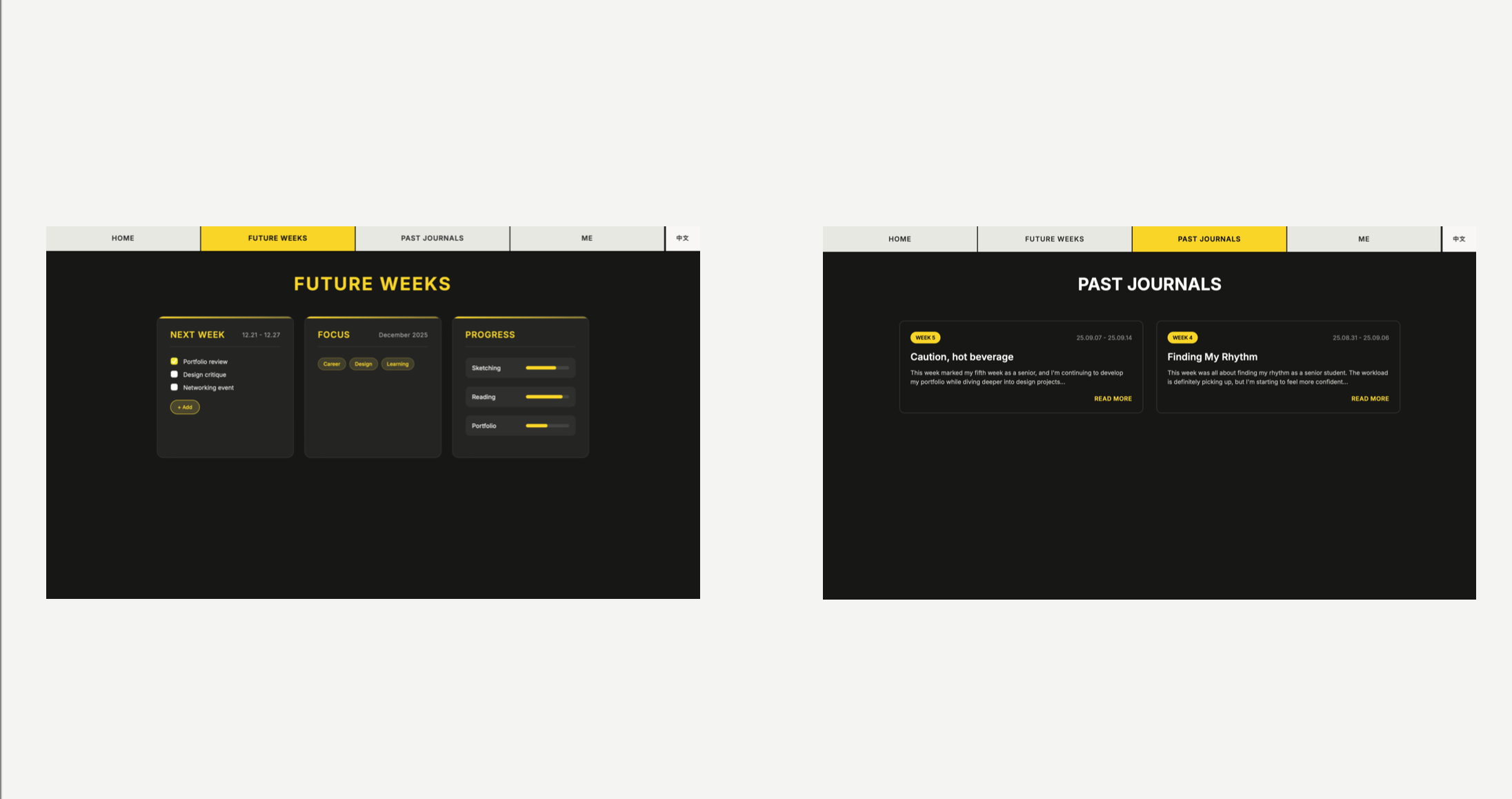
Individual Project
3 - week course project
This website was designed for my parent, making it one of the most honest design challenges I’ve worked on. Designing for someone I know well removed assumptions and exposed how easily interfaces can become exclusionary. The project centers on accessibility, clarity, and emotional ease, using simple layouts, restrained visuals, and intuitive interactions to support a non-technical user. This experience shaped how I think about responsibility in design and the importance of designing for real people, not ideal users.
“Designing for someone I love forced me to slow down and listen more carefully than I ever had before”
Early Concepts and Explorations
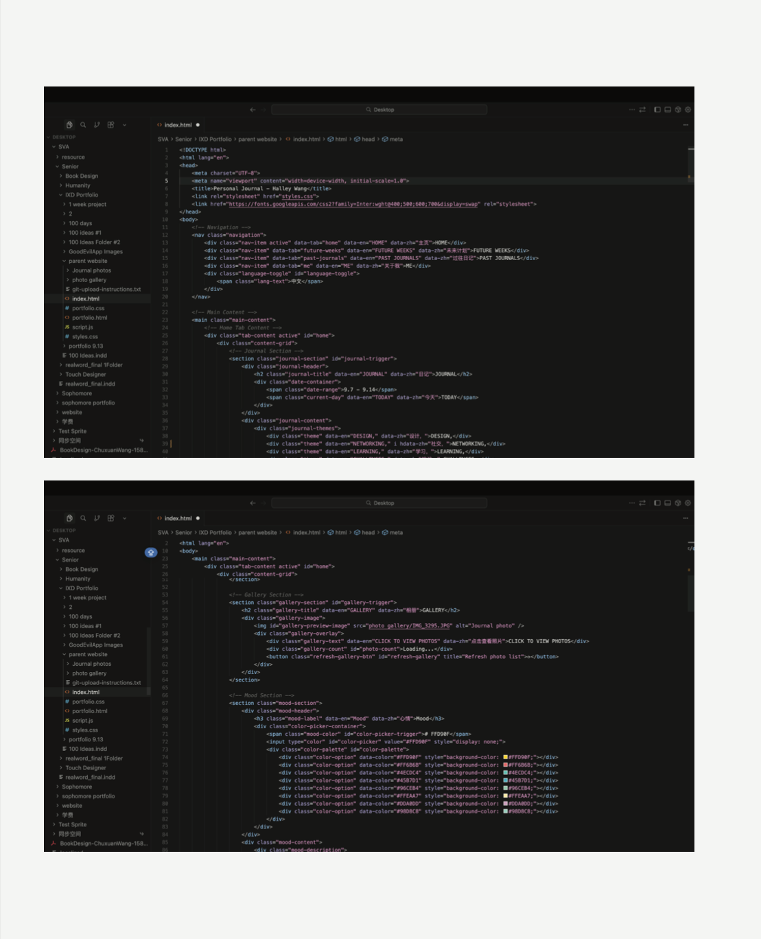
The early stage of this project began with a loose collection of ideas rather than a fixed structure. I explored features such as color modes and language translation as ways to support comfort and accessibility, especially for a non-technical user. At this stage, the focus was not on building a complete system, but on understanding which features genuinely added value and which introduced unnecessary complexity.
I used Cursor as a development tool to prototype and iterate on this project more efficiently. It allowed me to move quickly between design ideas and implementation, making small adjustments to layout, content, and interactions while keeping the focus on usability and clarity rather than technical complexity.
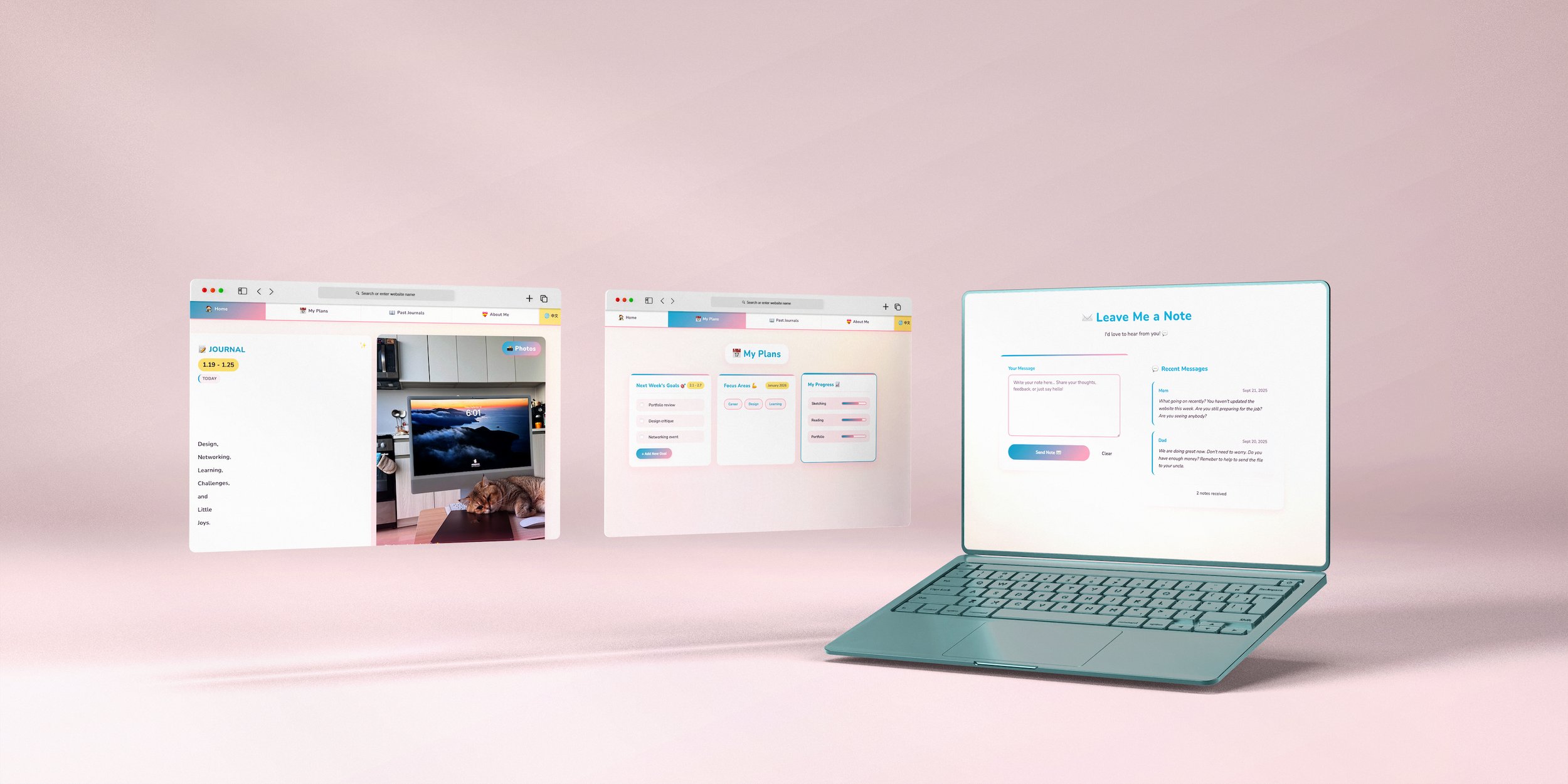
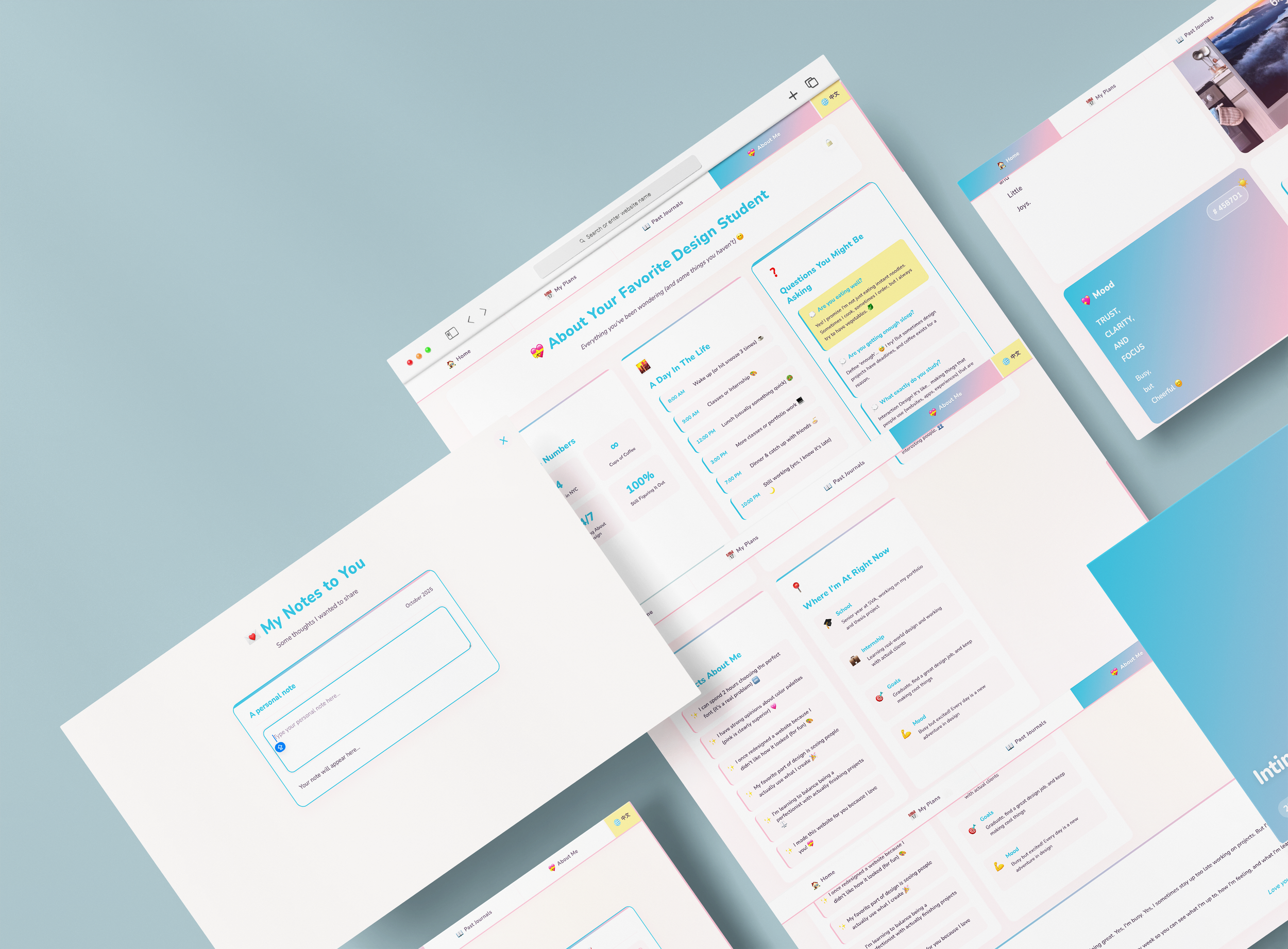
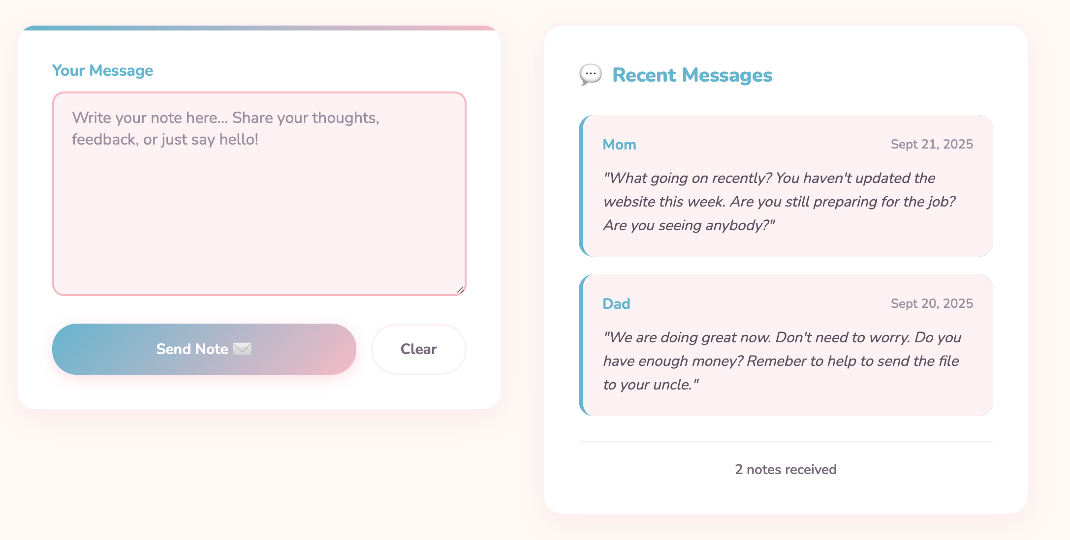
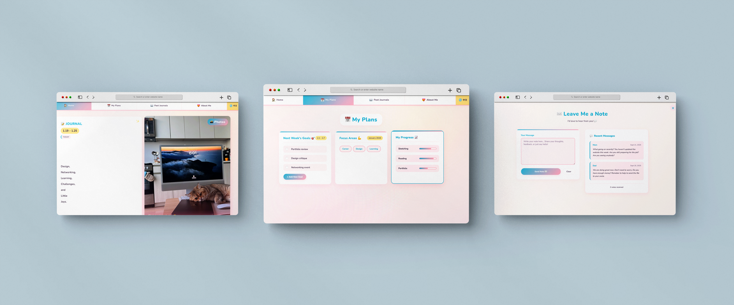
A Place for My Parents’ Voices
This feature allows my mom and dad to leave me messages that I can read anytime. Instead of real-time chat, it creates a gentle archive of care—questions, reminders, and everyday concern—captured as part of my life’s timeline.
“Not every idea needed to become a feature — learning what to remove was part of the design.”
Reflection
This project reshaped how I think about responsibility in design. Working closely with a real, non-technical user made it impossible to rely on assumptions or abstract personas. Instead, every decision had to earn its place through comfort, clarity, and ease of use. The experience reinforced the importance of restraint, reminding me that thoughtful design is often about reducing friction rather than showcasing complexity.
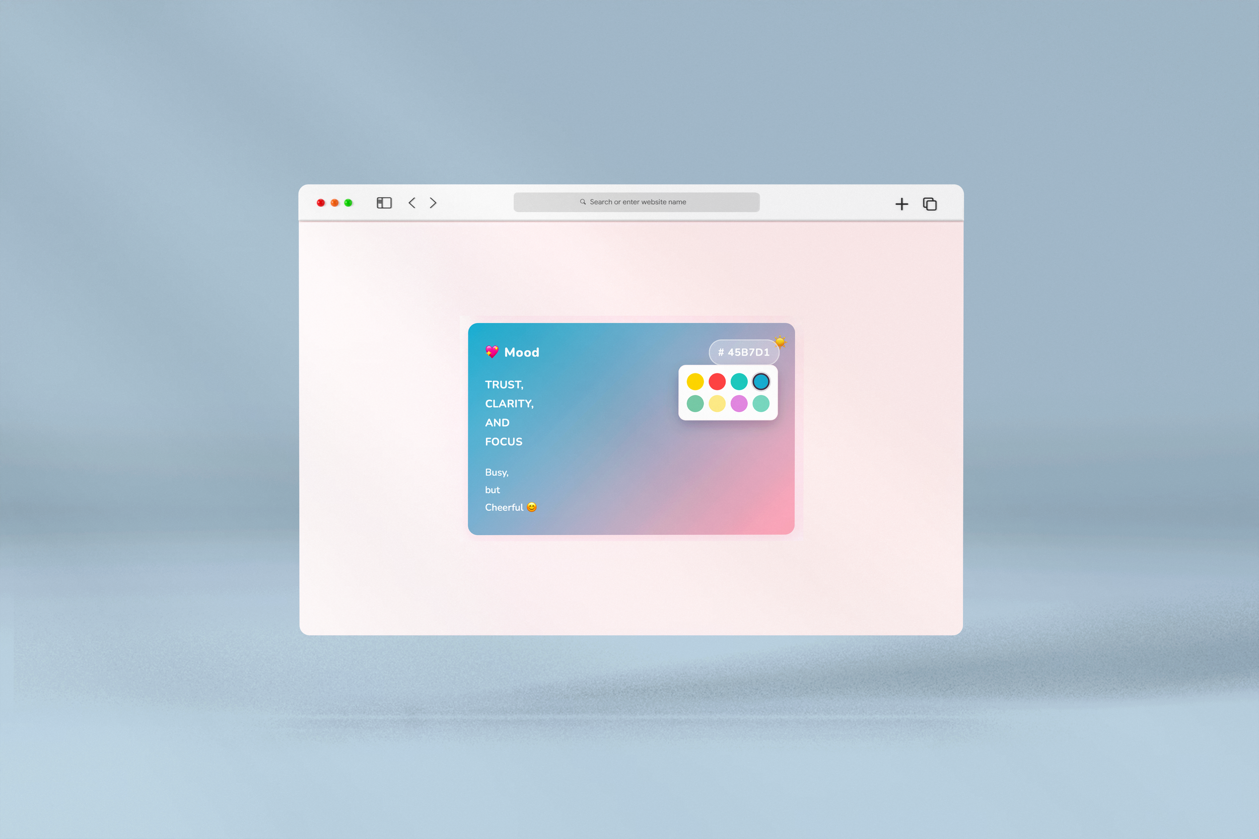
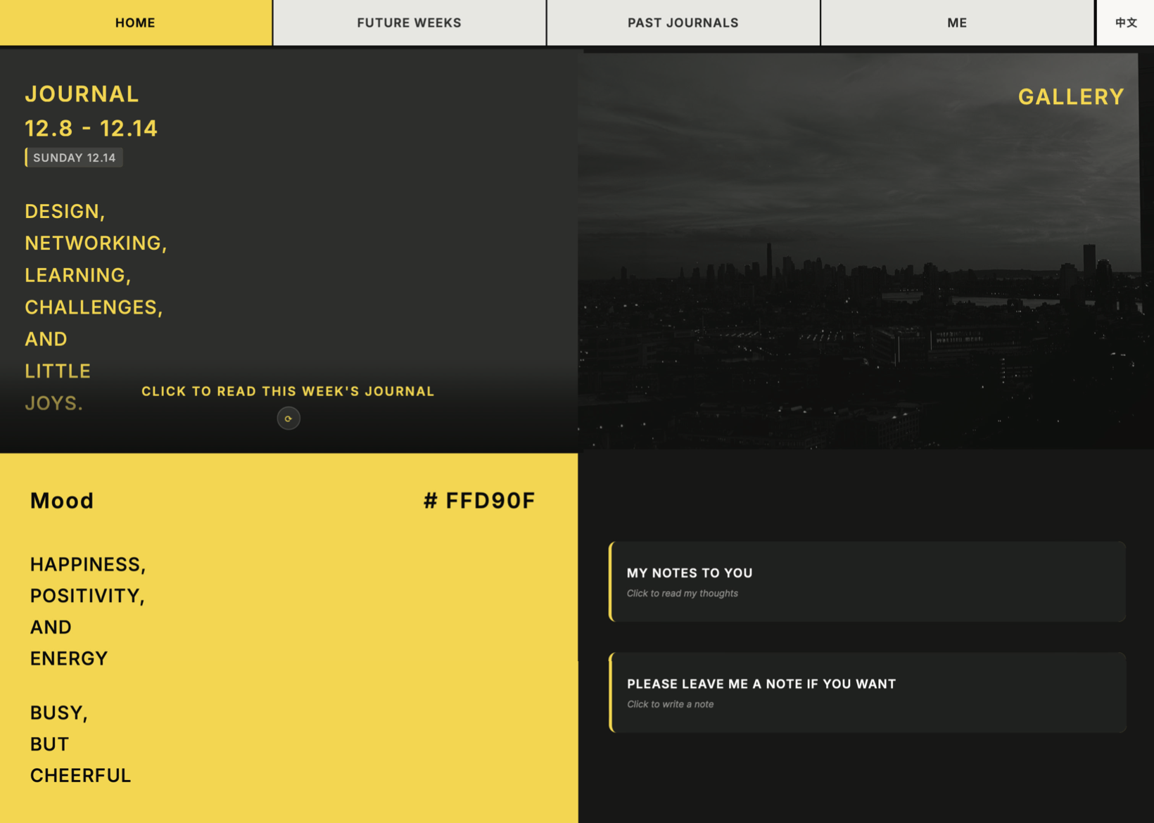
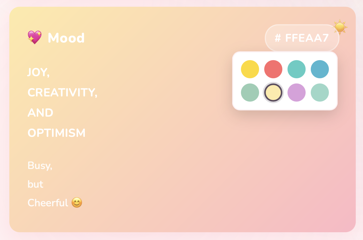
Mood-Based Color Customization
Users can move naturally between connection and play, learning how tone affects communication. The final app isn’t about being good or evil — it’s about understanding how conversations work, how rumors spread, and how we choose to present ourselves. It becomes both a tool and a mirror for social behavior.
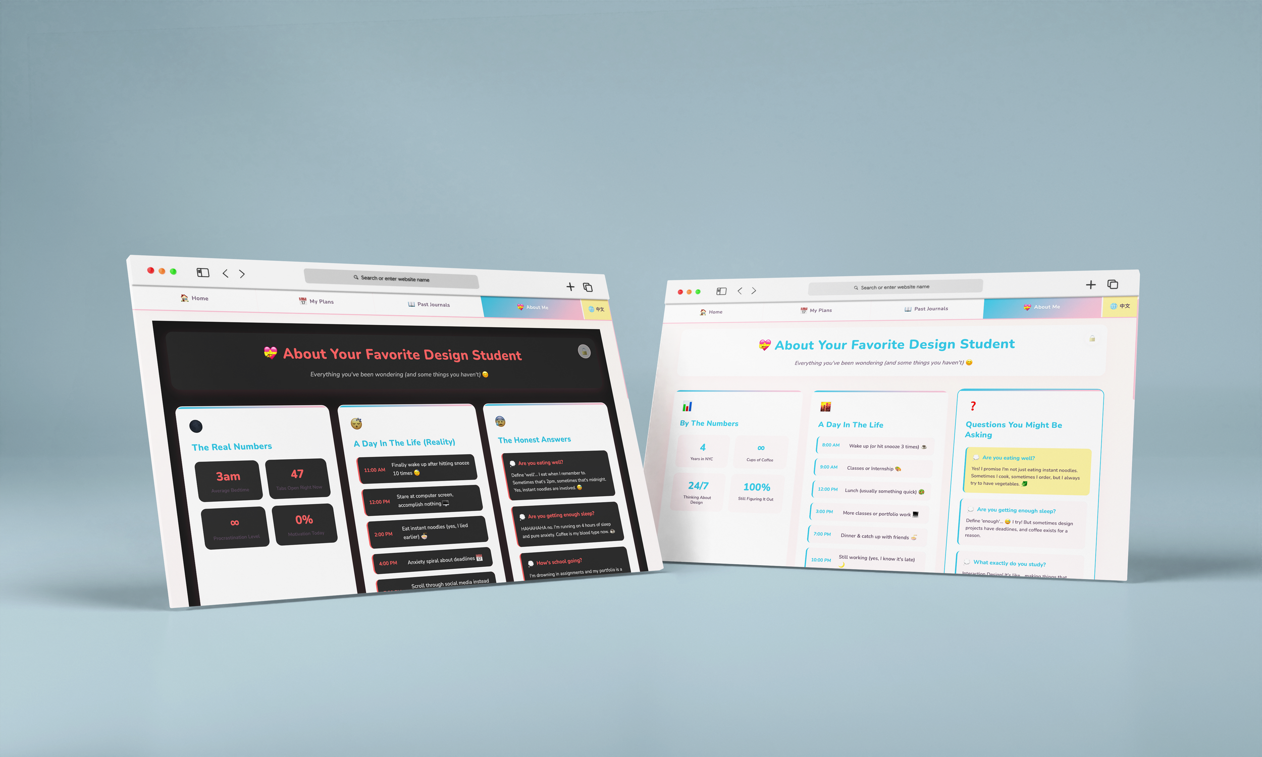
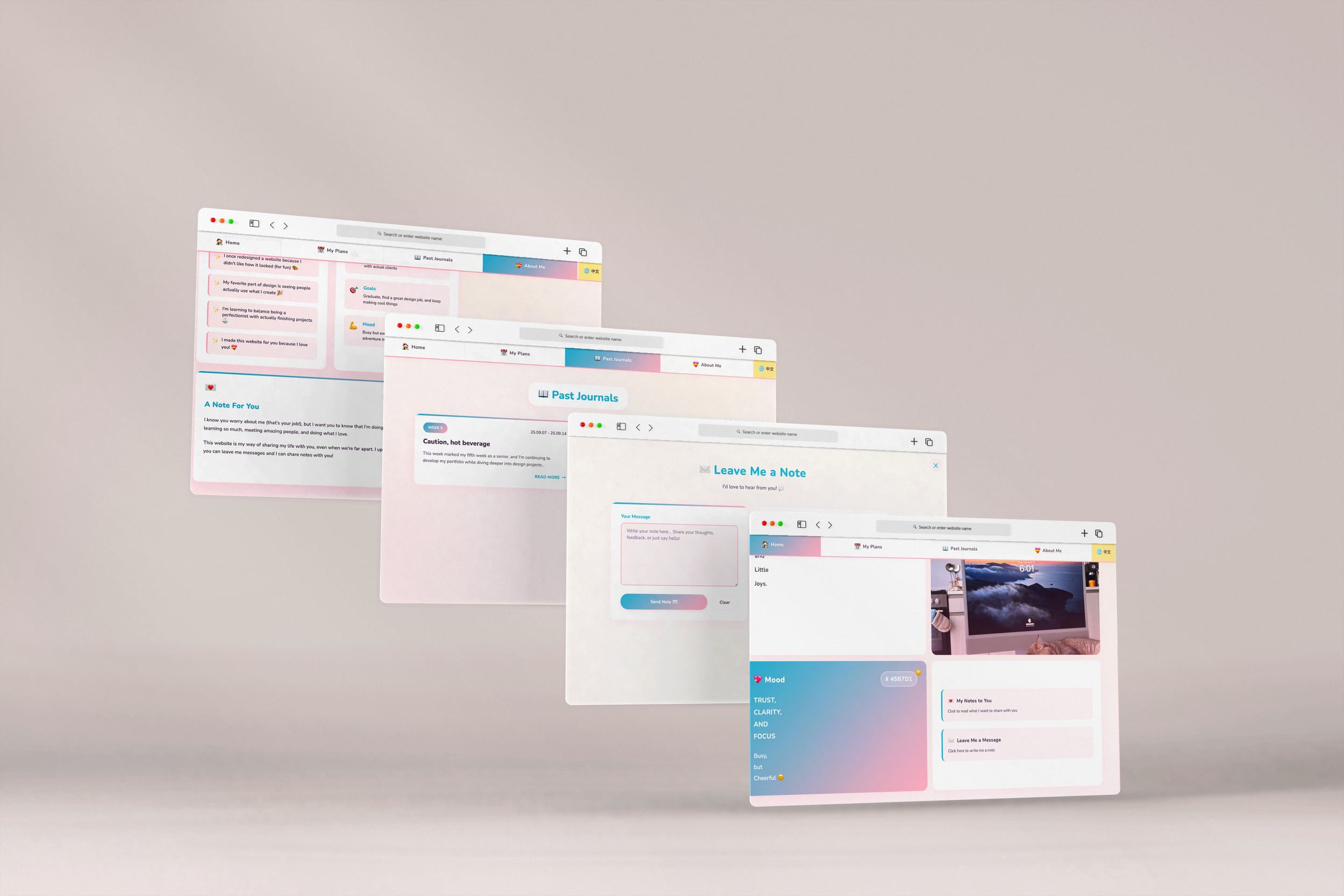
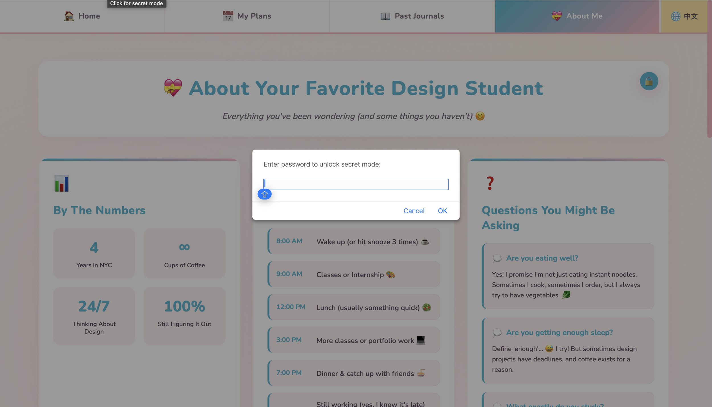
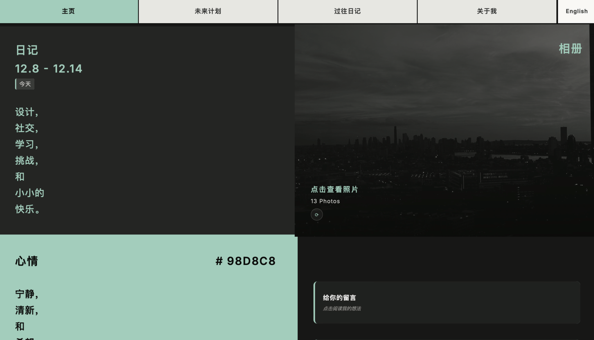
A Diary Meant to Be Private
This page was designed as a locked, personal diary—where I could be more honest, mundane, and real. It’s not meant for everyone, but if someone knows the password, they can choose to enter, turning privacy into an intentional, shared decision rather than a default setting.
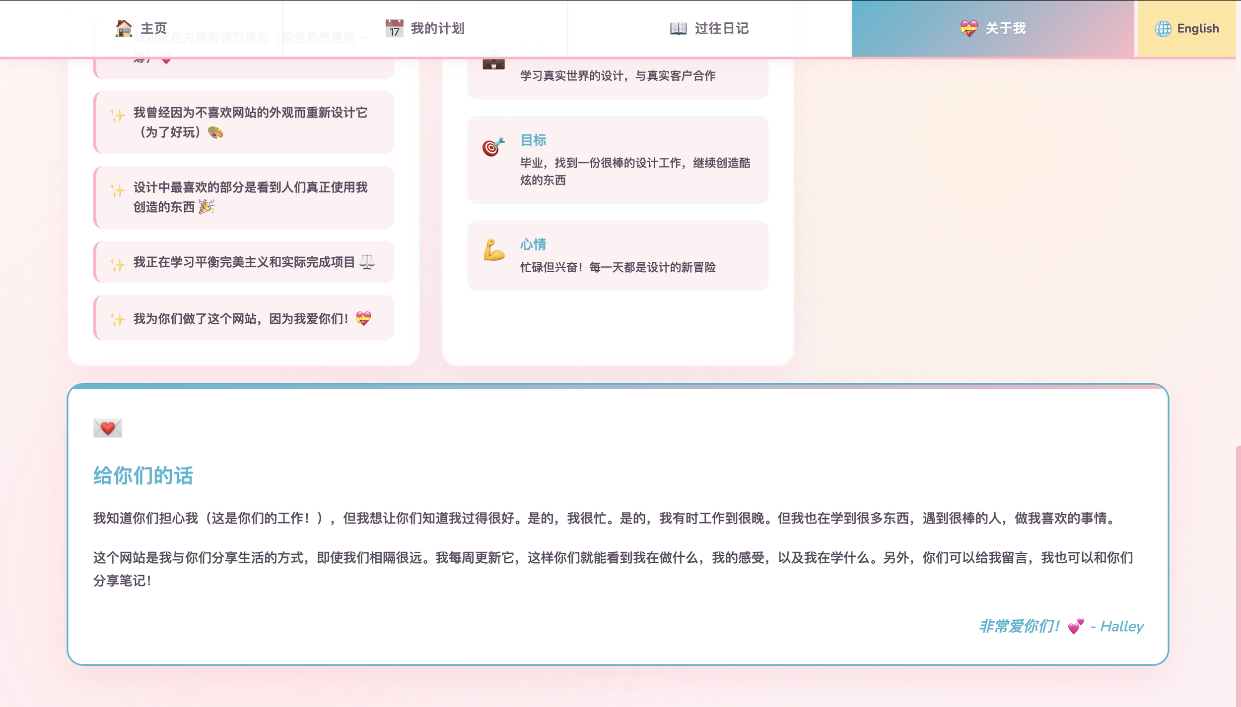
Designing in Two Languages
I designed this feature so the site can switch seamlessly between my language and my parents’. It allows me to express myself naturally, while letting them read my thoughts, plans, and updates in the language they feel most at home in.
Final Outcomes
Users can move naturally between connection and play, learning how tone affects communication. The final app isn’t about being good or evil — it’s about understanding how conversations work, how rumors spread, and how we choose to present ourselves. It becomes both a tool and a mirror for social behavior.