
Resonance
This project focuses on designing a custom typeface created exclusively for a single book, where every letter reflects the book’s character and rhythm.
Graphic Design
Type Design
Adobe Suites
Figma
Individual Project
7 - week course project

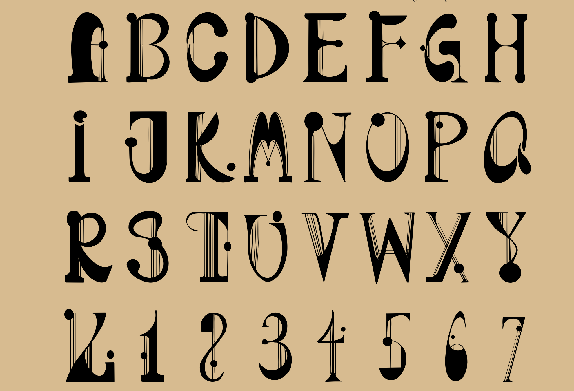
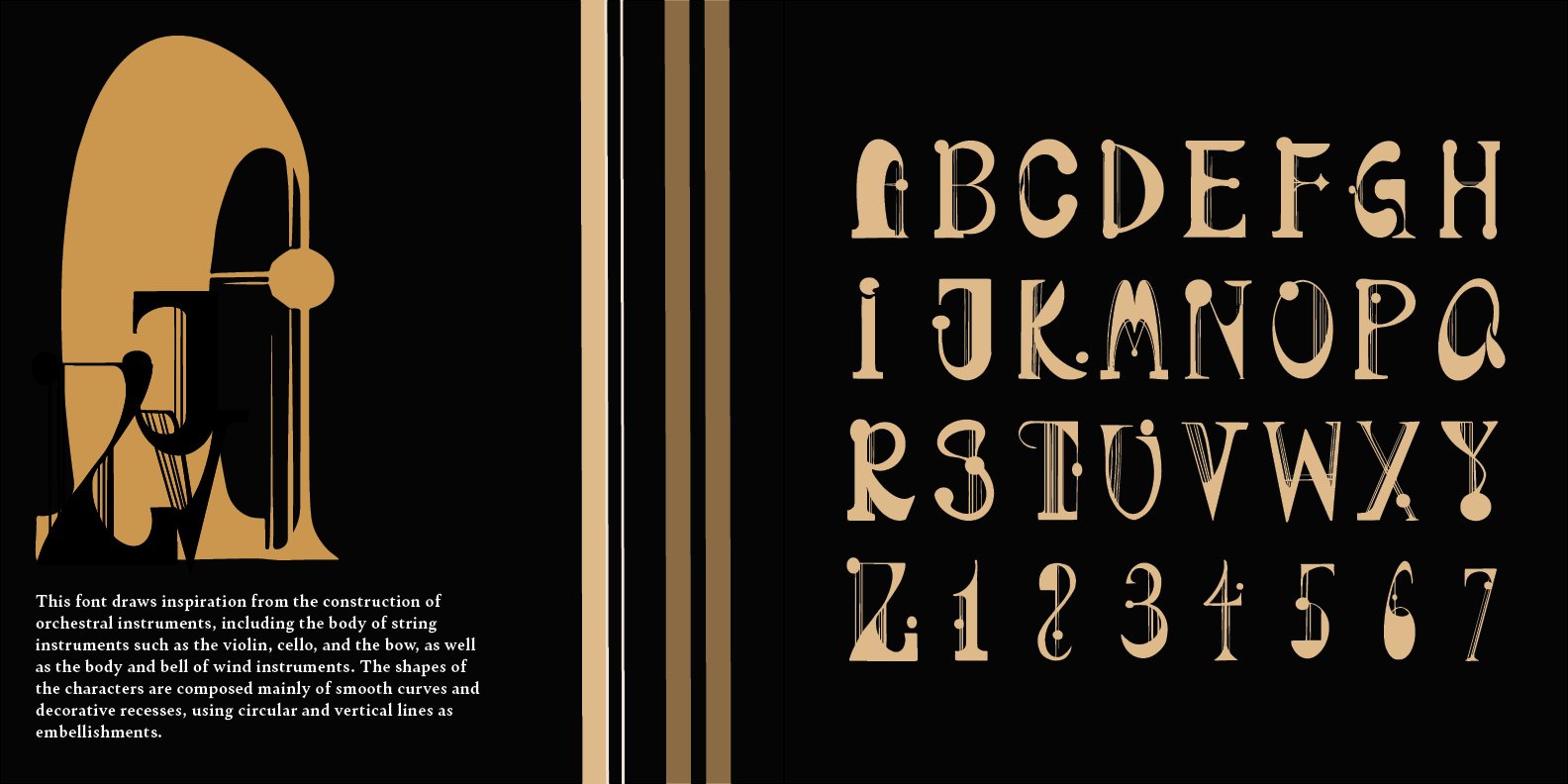
Each letterform was carefully crafted to align with the book’s tone, enhancing both readability and expression. The result is a typeface that not only complements the narrative but also becomes an integral part of it—embodying the book’s individuality and the designer’s dedication to precision and detail.
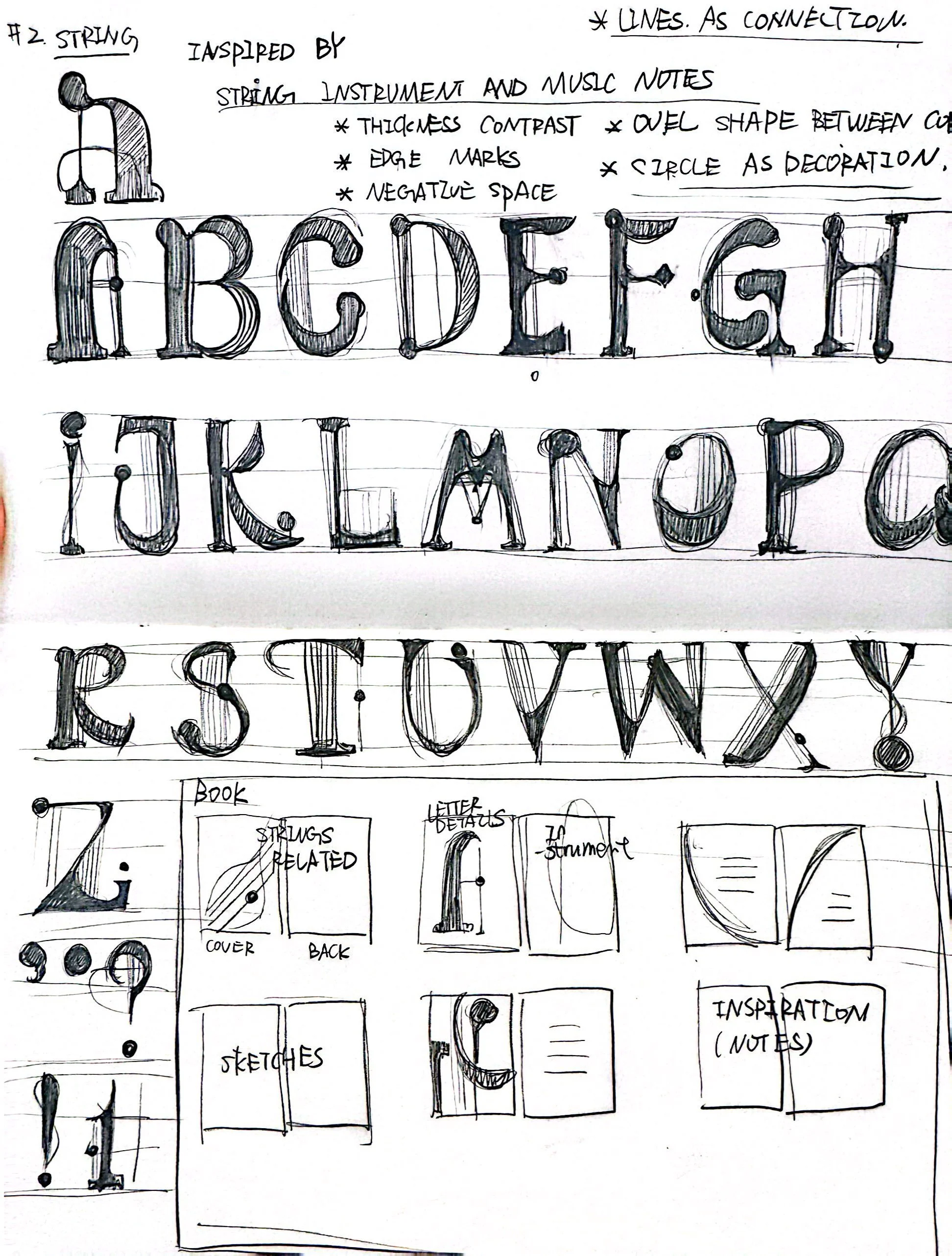
“I drew inspiration from my high school orchestra—each letter became like an instrument, distinct on its own but coming together to create rhythm and harmony on the page.”


Typography Design
The type design draws inspiration from the rhythm and harmony of an orchestra, translating musical flow into visual form. Each letter carries its own character and tone, yet together they create a unified composition—much like instruments blending in a performance.
Poster Design
The poster design visualizes the connection between music and typography through rhythm, balance, and motion. Dynamic layouts, overlapping shapes, and flowing letterforms evoke the feeling of a live orchestra—where sound becomes form and typography turns into performance.
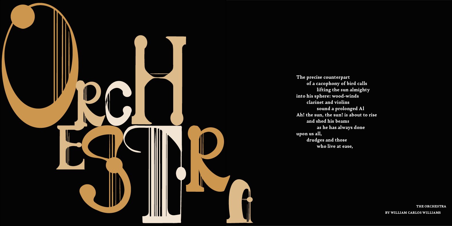
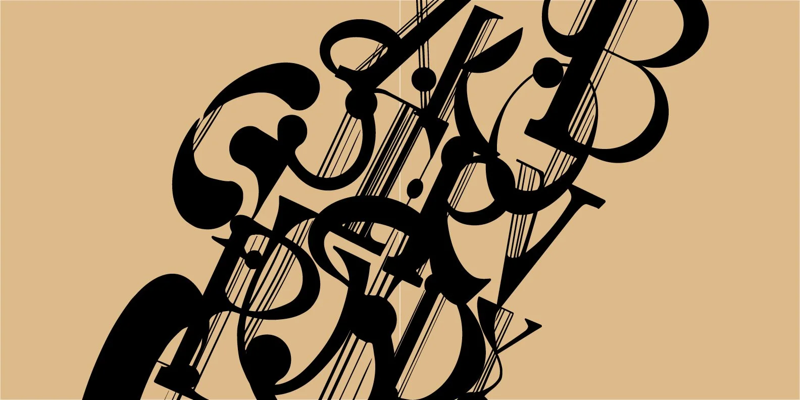
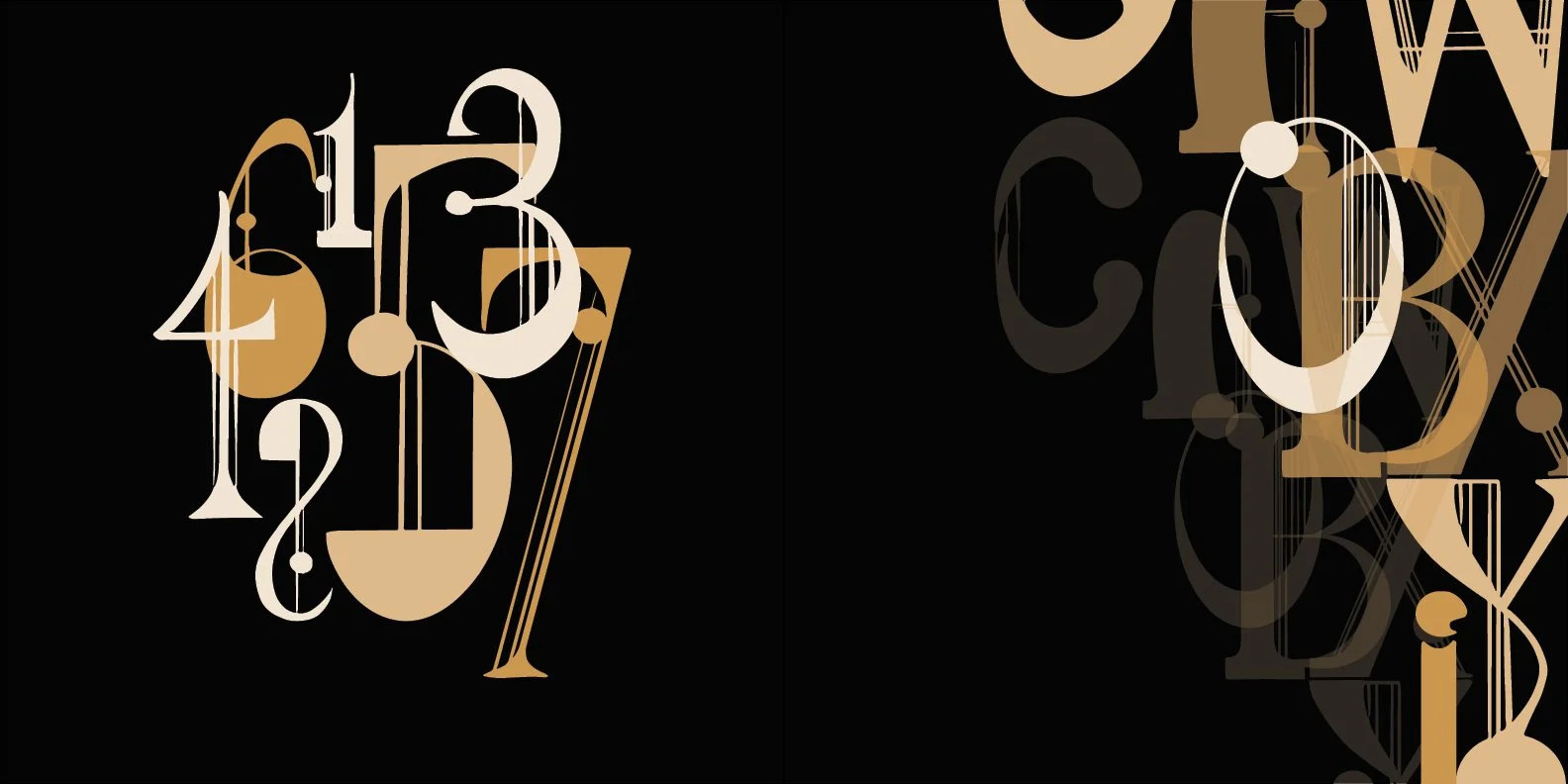
“I wanted the poster to feel like you could almost hear it—as if the letters were playing their own quiet symphony.”
Reflection
This was one of my sophomore-year projects, created at a time when I was still new to typography design. Looking back, some elements feel messy and inconsistent—but that’s also what makes it honest. Through this project, I realized how deeply design can connect to memory and emotion. Revisiting my time in the orchestra taught me to see type not just as form, but as rhythm and voice. If I could redo it now, I’d bring more restraint and structure—but I’d still keep the same sense of feeling that first inspired it.